Exploring System76’s New Rust Based Desktop Environment

A few months ago, System76 announced that they would be developing a new desktop environment based on the Rust programming language called COSMIC.
Their idea is to create a desktop environment that is similar to the one that is currently available for the Pop!_OS operating system, but with a different focus.
System76’s objective is to create something that is faster, more customizable, and free of the limitations of the GNOME desktop environment, and let’s face it, we’re all curious how this desktop will look.
This post will explore how this new desktop environment is shaping up.
Disclaimer#
The COSMIC desktop is still a work in progress and is not yet ready for use, most of what you’ll see here is a preview and subject to change.
Settings#
As of right now, Pop!_OS uses GNOME Settings app but System76 is hard at work developing a new version of the settings app for the COSMIC desktop using GTK 4, here’s a comparison between the two.
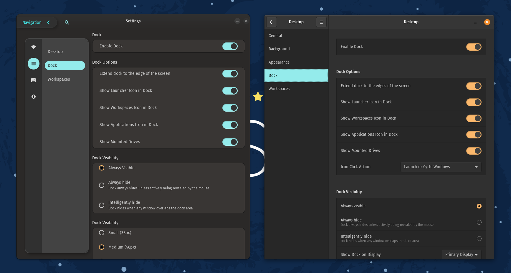
Here are some of the UI changes I noticed:
- There’s no visible distinction between the window title bar and the body of the window.

- The app is using rounded corners in the window and in elements inside the app, exactly at 12px.
- The interface uses CSS for styling.
- The navigation view can be collapsed using the
Navigationbutton in the top left corner.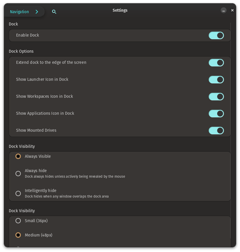
- The toggle buttons are now using the same color as the navigation view.
- The search bar is available everywhere in the app.

Search#
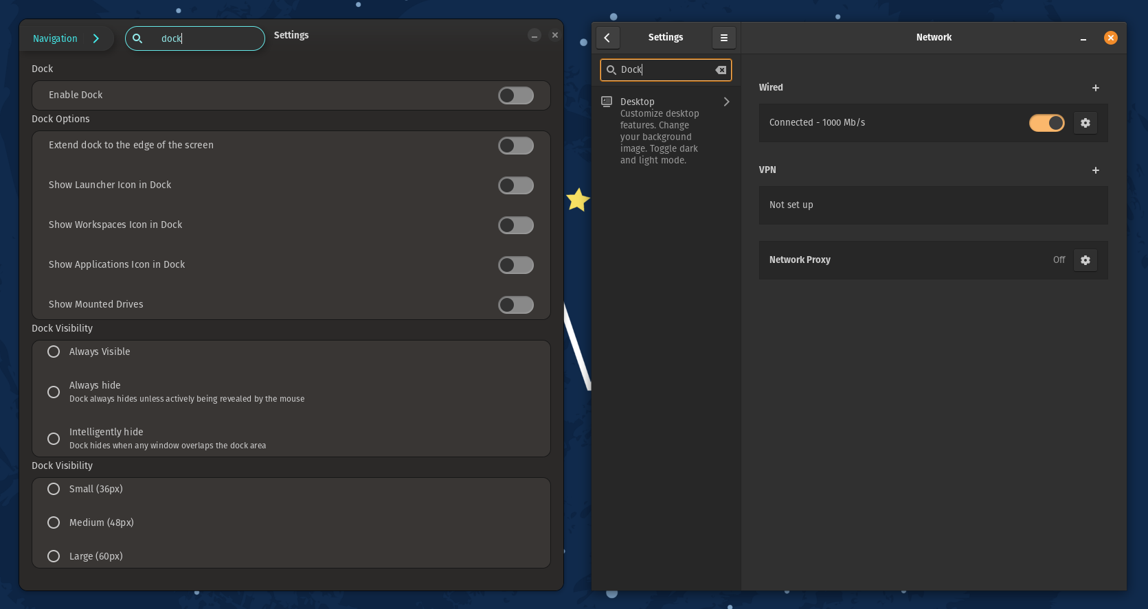
One of the biggest changes is the search feature, in GNOME Settings, the search bar is available at the top of the navigation view, this is problematic when inside nested menus as the user has to go back to the beginning to access it, but in COSMIC it’s available everywhere in the app, no matter how deep inside a menu the user is.
Settings at a glance#
The search also displays a list of all the settings that match the search criteria and not only where they’re located as GNOME Settings does, this makes it easier to change your settings without having to leave the section you currently are in.
Launcher#
There is already a working version of Pop Launcher, it’s built using GTK.
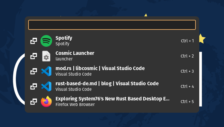
The new launcher is fairly similar to the one that is currently available in Pop!_OS.
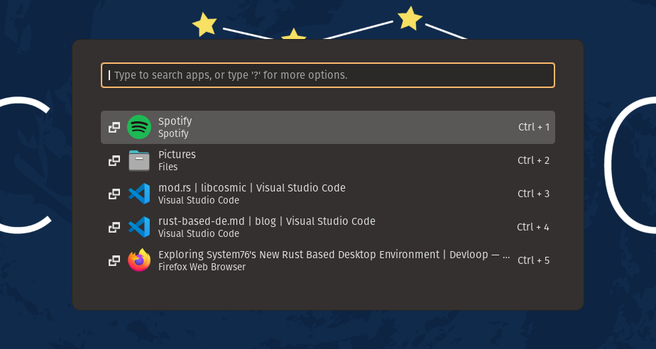
There aren’t any major changes, but there are some minor ones:
- The launcher is a bit smaller and more compact.
- The launcher selection has a yellow border around it, as opposed to the gray one already present in the current launcher.

I found a small bug where if you selected an application and then return to search something else the launcher would panic, I filled an issue.
App Library#
Pop!_OS recently received an update to the App Library where instead of opening in full-screen, the app opens in a floating window.
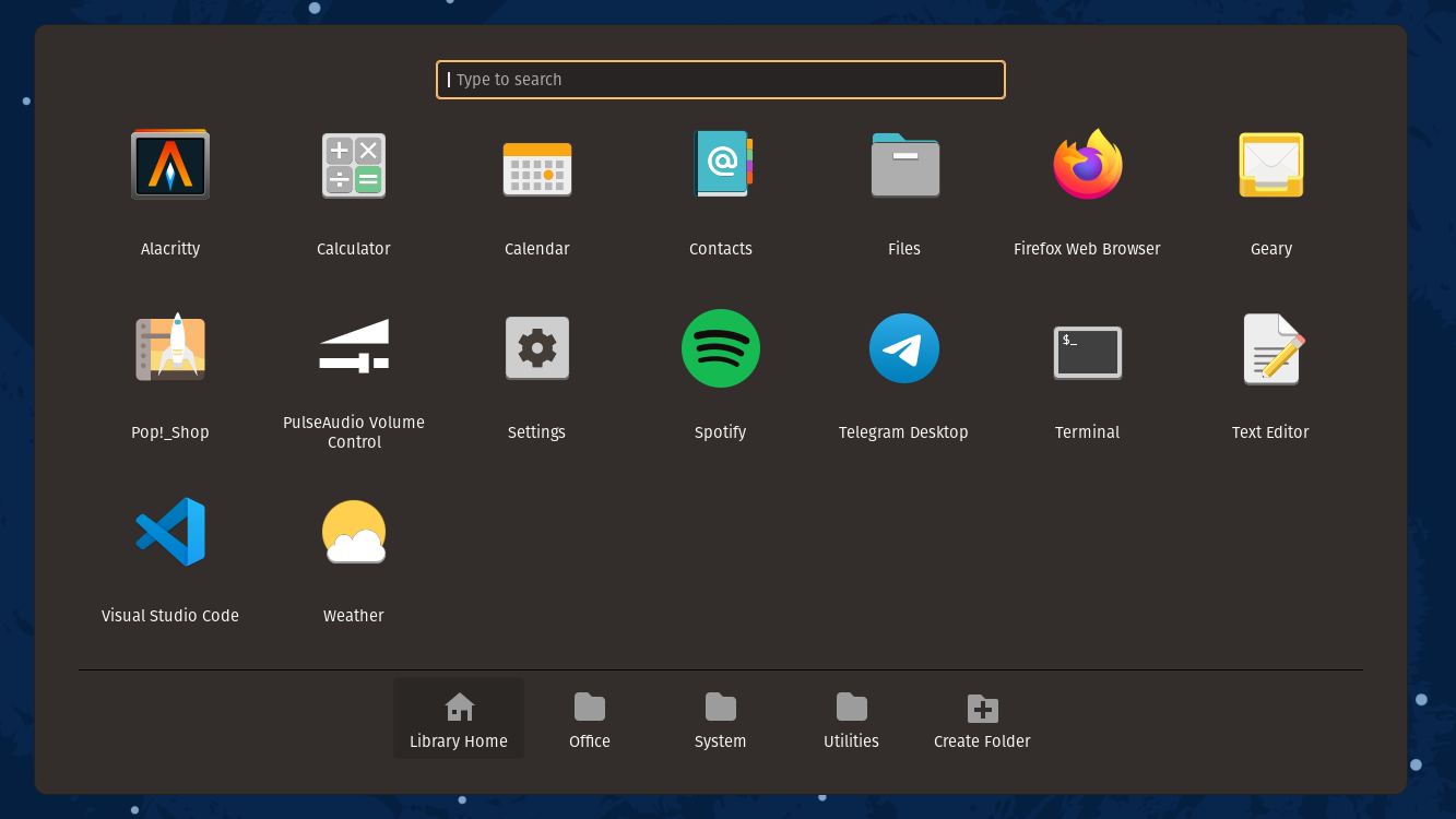
COSMIC will also have an app library, but it will be built using GTK.
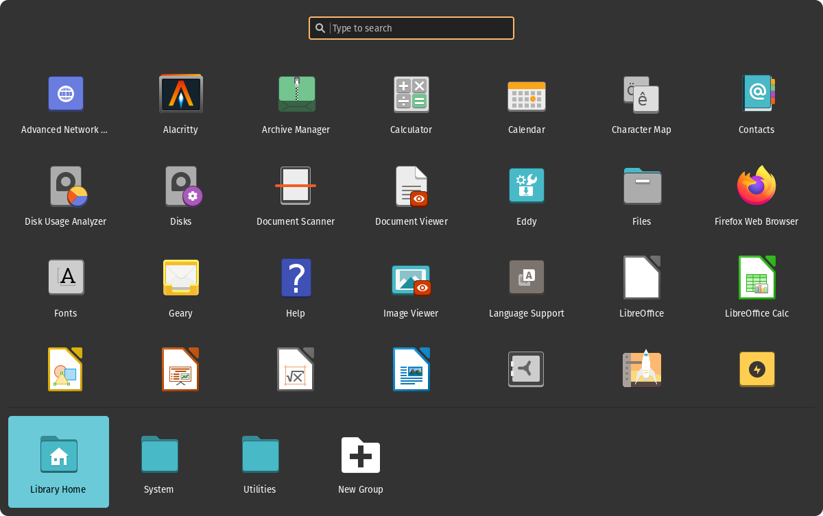
We can notice that the new app library is very similar to the one that is currently available for the Pop!_OS, the only difference I could notice was the use of colored folder icons.
As expected, there are some bugs present and some features missing, after all this is still a work in progress.
I found a small bug where if you try to navigate the app grid with the keyboard, it opens the second app it selects, I filled an issue.
Dock#
The new dock looks basically the same as the one that is currently available.

There’s no visual difference between the two, we expect them to look and work the same.

Here are some small details that I noticed:
- Currently, it’s only possible to drop icons from the app library to the dock.
- Non-favorite applications don’t show up in the dock.
- The dock is not expandable to the sides yet.
- It is not possible to rearrange the dock icons.
Panel#
The panel also was rewritten, it’s now built using GTK.

It not currently capable to trigger Workspaces or Applications, but it is capable of displaying a calendar and media controls when clicking the date button, and both of them work.
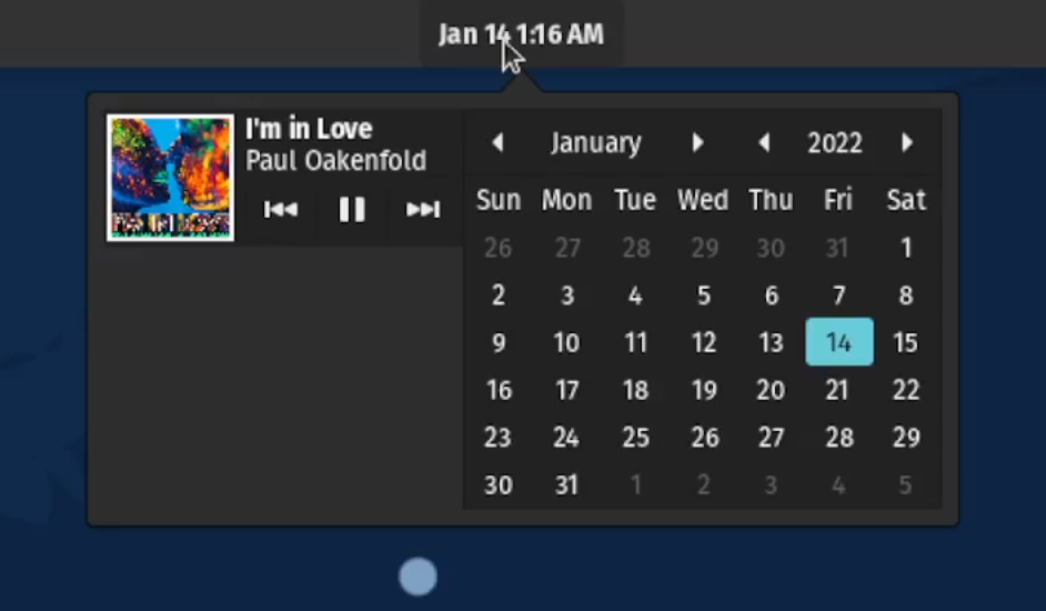
The new popup is considerably smaller, but we can expect it to look and work the same as the one that is currently available.
The tray icons and system controls are still missing, but I’m sure they will be added in the future.
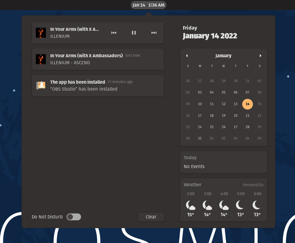
There’s quite a difference between the two, but then again, this is still a work in progress.
Compositor#
System76 is also working on a new compositor, they’re using Smithay for the backend.
I tried running the compositor on a tty session, but the developers have not implemented this behavior yet, we can, however, see the output of the compositor in a window.
Once we have this open, we can run any application that we want to test, and it opens inside the compositor.
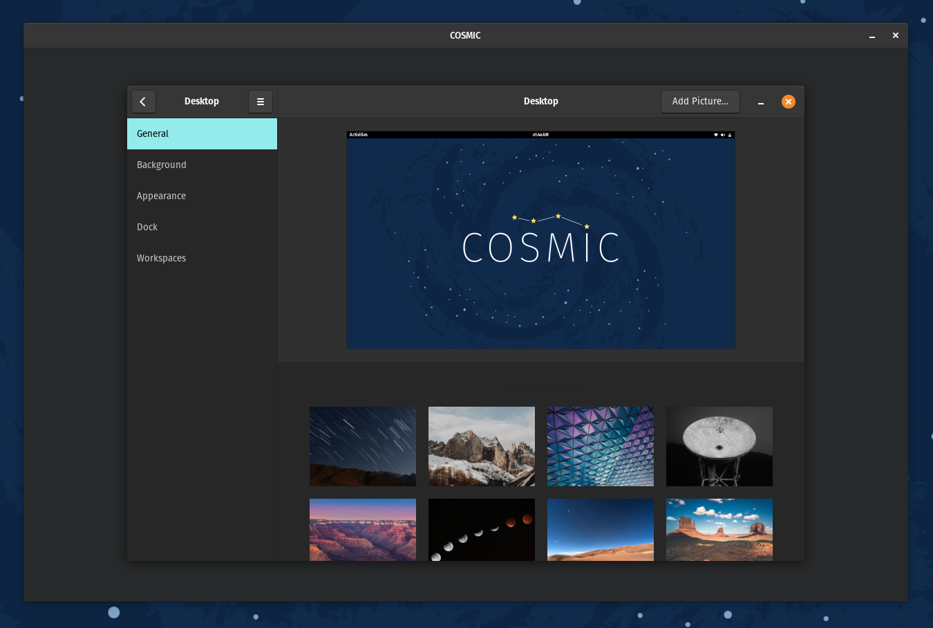
The settings app opened inside the compositor, every change I made to the settings app reflected on my host OS while running inside the compositor.
I will run every new piece of software System76 is working on and see how it works inside the compositor in the future.
Expect a follow-up post soon.
Conclusion#
This is the first step towards creating a new desktop environment, there’s no doubt that there are many things that will be improved.
This is just the beginning.
I hope that this article gives you an idea of what the future of the COSMIC desktop will be like.